In this project, I undertook the design of a mobile application for the musician's site, Audiofanzine. Despite the site recording seven milion page views per month, it lacks a dedicated mobile application.

First, I scrutinized the interface to reveal existing problems.
An immediate observation was the presence of two versions of the site, mobile and desktop, with distinct web addresses. However, not all pages automatically detect the device type, increasing the risk for mobile users to end up on a desktop-designed interface.
In the mobile version, I identified various design problems, including a lack of visual consistency, such as inconsistency between the two side menu panels.
A more thorough analysis would have involved site hierarchy tests and an assessment of the needs of Audiofanzine users. Metrics from "m.audiofanzine" would also have provided useful indicators.
I examined interfaces from competing sites for ideas, including the common use of tab bars, considered more user-friendly than the navigation bar on the Audiofanzine mobile site.
To improve the user experience, I formulated three main objectives:
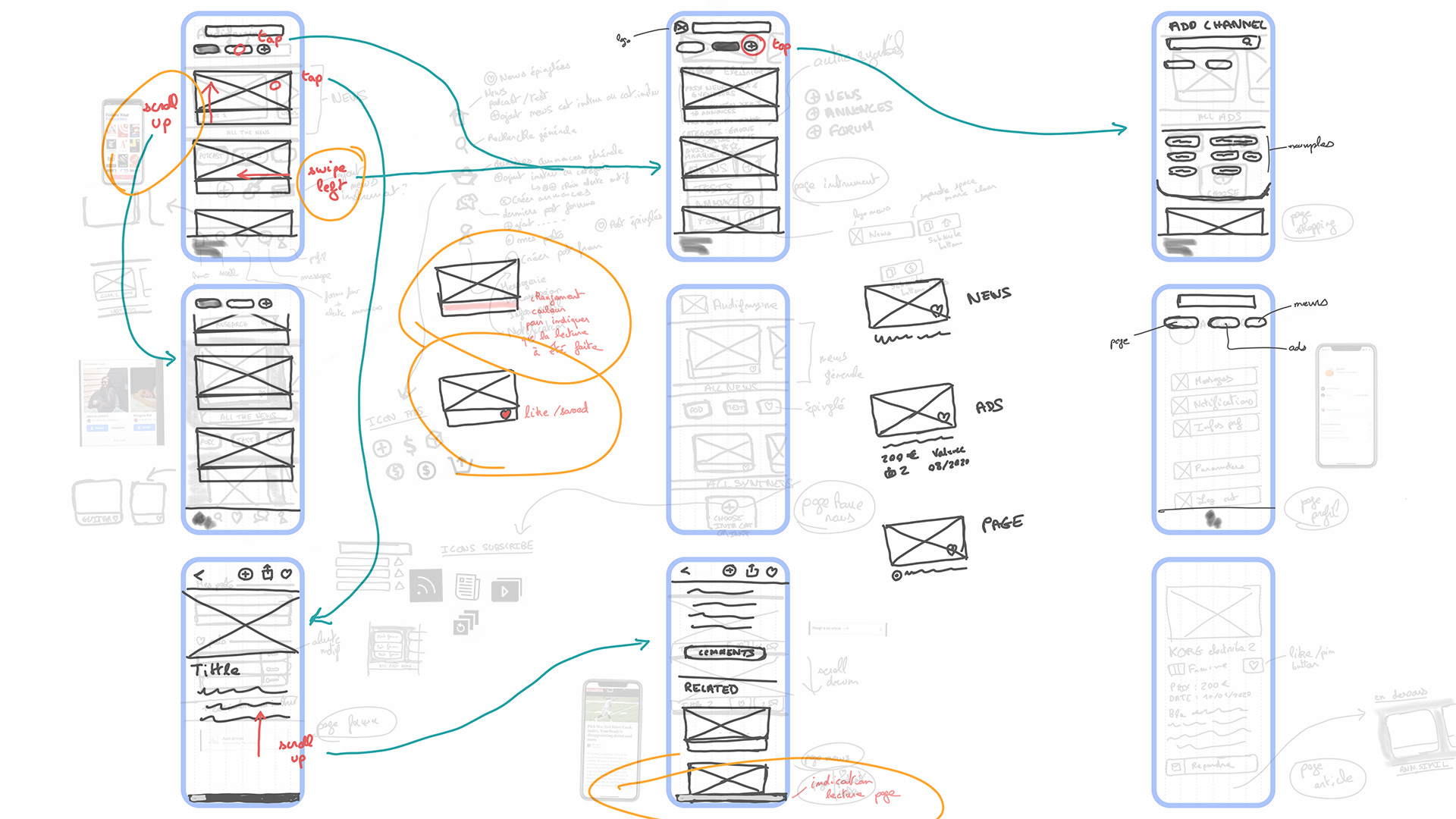
Iterative usability testing confirmed design decisions.
The graphic charter includes a new logo to reflect the renewed aesthetic.
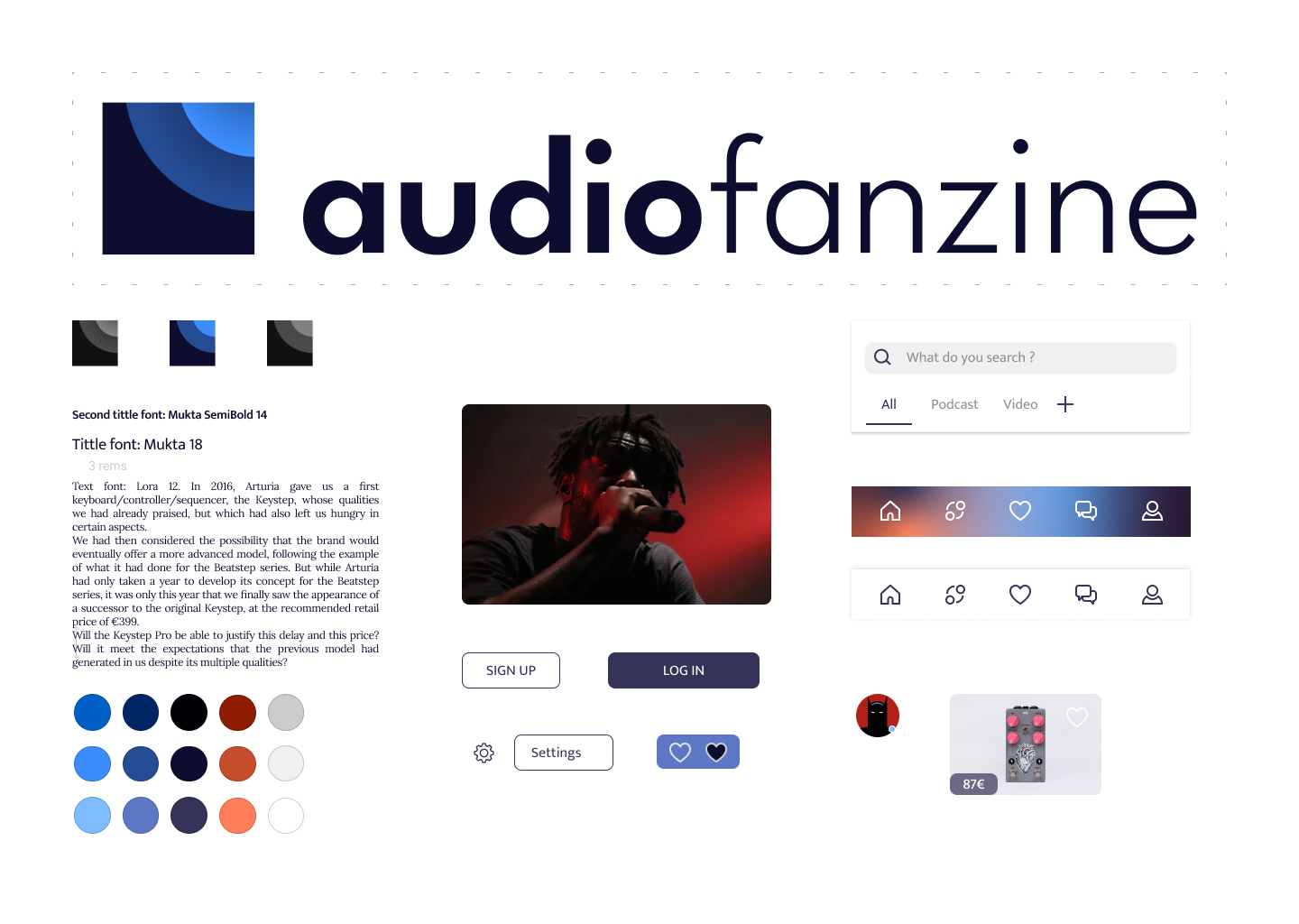
Navigation relies on a tab bar allowing access to different sections of the site: News, Ads, Favorites, Messages/Forum, Profile. Upon opening, the user can smoothly scroll through the site's news feed, as well as ads. They can also search for specific content via the search bar, such as Fender Stratocaster guitar ads or discussions on a drum machine. As soon as he arrives, the user can scroll through the site’s news feed in a pleasant way. The same goes for the ads.
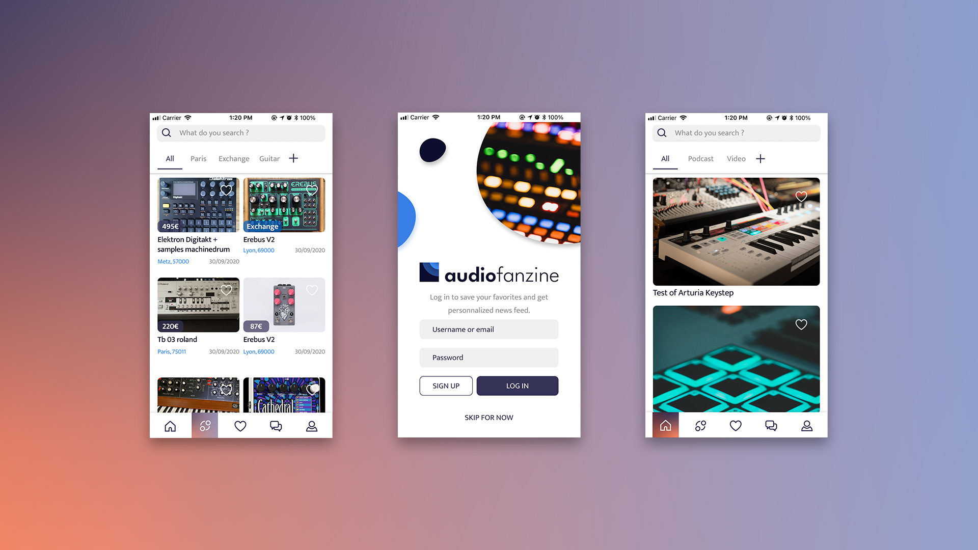
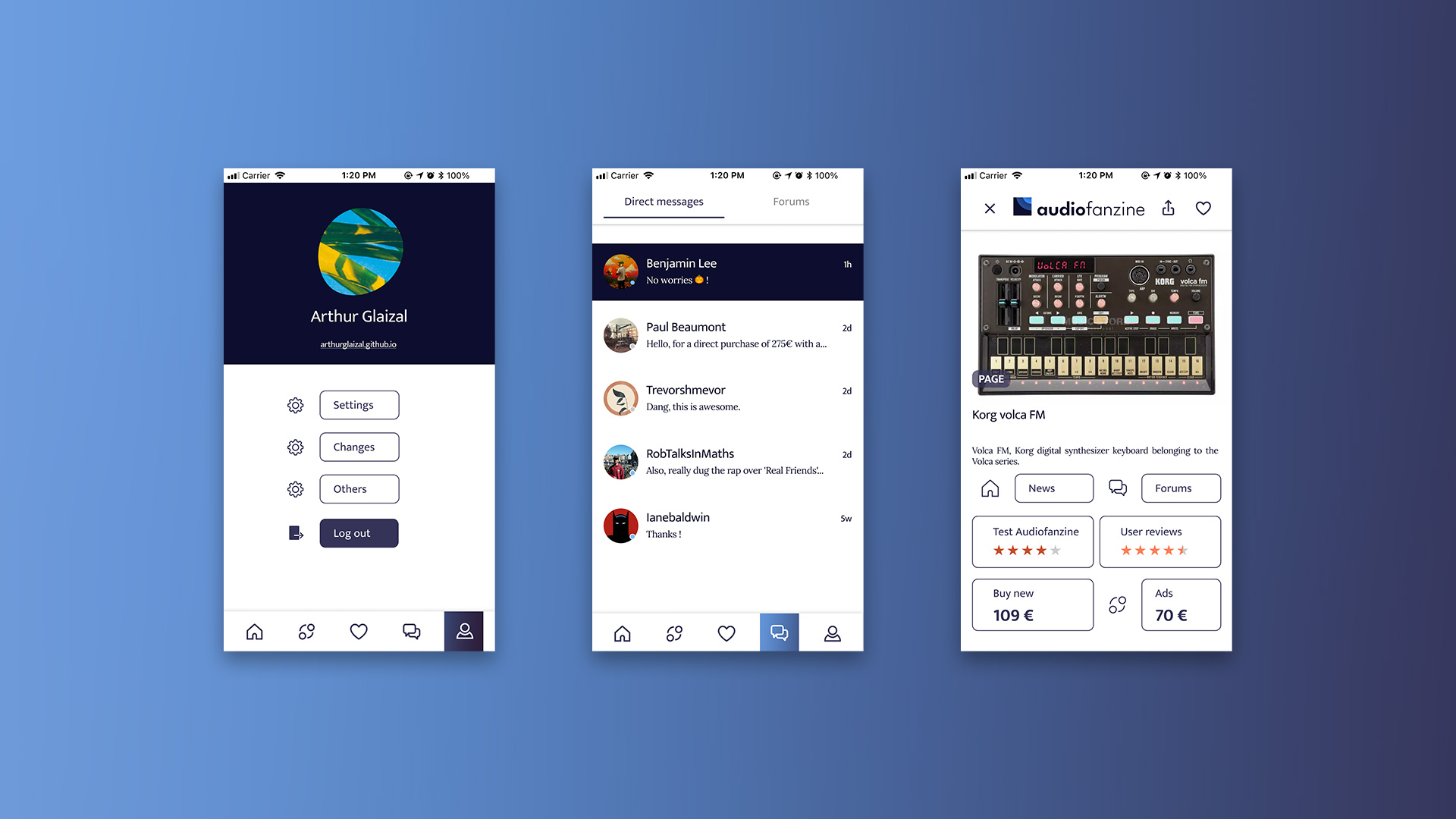
Various animated or interactive elements provide visual feedback and dynamism to the application.
I then developed a high-fidelity prototype, integrating planned interactions and visual design for maximum resemblance to the final product.
You are free to try, download, or use the prototype:
Merci !